When I was ten, my dad took a couple of friends and me to see a movie. My friends and I had the choice of watching Rollercoaster, which was about a terrorist attempting to extort money from amusement parks by blowing up sections of rollercoaster track just as the coaster gets to them, or this new science fiction film that had recently opened and was getting good notices. As you've no doubt guessed, we chose poorly, while my dad went to the other film, which was (as you've probably also guessed) Star Wars. Meanwhile, one of my friends threw up on the car ride home.
I saw Star Wars in the theater four times, which to this date remains the last time I ever saw a film multiple times in the theater. Early in the film, right after the text crawl, but before the rebel ship comes on screen, you're treated to a view of a star field. In fact, here it is (click to enlarge):
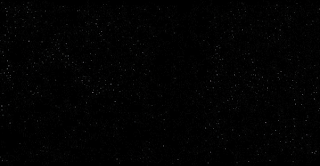
I saw Star Wars in the theater four times, which to this date remains the last time I ever saw a film multiple times in the theater. Early in the film, right after the text crawl, but before the rebel ship comes on screen, you're treated to a view of a star field. In fact, here it is (click to enlarge):

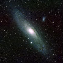
When I saw the film again recently, there was something vaguely unsettling and unnatural about the look of the stars in this scene. For the sake of comparison, here's a real star field, with roughly the same level of detail (again, click to enlarge):

What strikes me now (although I was oblivious to it back in 1977, at least consciously) is how much more regular the star field is in the Star Wars frame than it is in the real photograph. There isn't much variation in the stars in the movie frame, with the top fifty or so being about the same brightness; in contrast (no pun intended), there are many more dim stars in the real photograph, and they fade out gradually, suggesting that there are plenty of stars that are in the field of view, but just beyond the limits of detectability, in this photograph at least. And there are, in fact. For some reason, that sense of infinity, which isn't in the movie frame, appeals to me greatly.
You can sort of see the reasoning behind this if you imagine for the moment that all stars are of the same intrinsic brightness, and that the only reason that some appear brighter and some appear dimmer is that they're closer or further away. (Sort of the way that most adults are of about the same height, but appear to be different sizes because they're at different distances.) And because there is more space far away than there is close up, there are more stars that are far away and therefore dim than there are stars that are close up and therefore bright.
Now, as it happens, stars do vary in actual brightness—sometimes dramatically—but the basic explanation still holds, and is supported by actual counts of bright stars versus dim stars. And I think that through long association with the night sky, we gain an appreciation for that kind of aesthetic. Once upon a time, every human on the planet with reasonably good vision had that association. Nowadays, it's less common. But the potential is still there within each of us, and in my case, it expressed itself in, among other things, my preference for the real star image rather than the Star Wars movie frame.
And this set me to wondering whether a sense for this kind of aesthetic could be mechanized in any way. In a very naïve way, it surely could. The way that the star counts vary by brightness follow a fairly well-understood formula, and a star field could easily be scanned for how well it matches that formula. But I think it's a common feeling that that would fall well short of a genuine sense of aesthetics. There would have to be a larger framework for that kind of aesthetic sense.
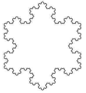
Could such a framework lie in fractals? Fractals are, generally speaking, patterns that are self-similar; that is, the appearance of the whole at a large scale is repeated in small parts of the pattern at smaller scales. Examples of fractals range from prosaic snowflake patterns:
You can sort of see the reasoning behind this if you imagine for the moment that all stars are of the same intrinsic brightness, and that the only reason that some appear brighter and some appear dimmer is that they're closer or further away. (Sort of the way that most adults are of about the same height, but appear to be different sizes because they're at different distances.) And because there is more space far away than there is close up, there are more stars that are far away and therefore dim than there are stars that are close up and therefore bright.
Now, as it happens, stars do vary in actual brightness—sometimes dramatically—but the basic explanation still holds, and is supported by actual counts of bright stars versus dim stars. And I think that through long association with the night sky, we gain an appreciation for that kind of aesthetic. Once upon a time, every human on the planet with reasonably good vision had that association. Nowadays, it's less common. But the potential is still there within each of us, and in my case, it expressed itself in, among other things, my preference for the real star image rather than the Star Wars movie frame.
And this set me to wondering whether a sense for this kind of aesthetic could be mechanized in any way. In a very naïve way, it surely could. The way that the star counts vary by brightness follow a fairly well-understood formula, and a star field could easily be scanned for how well it matches that formula. But I think it's a common feeling that that would fall well short of a genuine sense of aesthetics. There would have to be a larger framework for that kind of aesthetic sense.
Could such a framework lie in fractals? Fractals are, generally speaking, patterns that are self-similar; that is, the appearance of the whole at a large scale is repeated in small parts of the pattern at smaller scales. Examples of fractals range from prosaic snowflake patterns:

to the sublime Mandelbrot set:

Fractals have been used to describe natural patterns as varied as the sound of wind through trees and the coastline of Great Britain. And they can be used to describe the appearance of star fields as well. A star field looks quite the same if you zoom in and increase the brightness. The details are different, so in that sense it is not quite like the snowflake fractal or even the Mandelbrot set. But statistically, the close-up shot and the wide-angle shot are essentially identical.
I cannot say exactly what it is about the "fractality" of these patterns that is appealing. And it does seem as though a certain sense of variation (absent in the snowflake, present to an extent in the Mandelbrot set, and rampant in real star fields) is vital to maintaining visual interest. But I can't escape the notion that self-similarity is something that people generally find captivating and inviting, once they recognize it, and is a large part of why looking up at the night sky is such a natural thing to do.